
Adapted from Kate Hughes Salesforce blog post October 2023
Effectively organizing and accessing the right information is crucial for Trailblazers in various roles, from Admins and Designers to Architects and Consultants. With dynamic components user record pages can be compact. Overcoming the challenge of simplifying the user experience of record pages is essential for optimizing productivity. We sought advice from #DreamDesigner Shahida Robertson on successful redesign strategies. Robertson collaborated with a donor relations team at a girls’ education nonprofit, recognizing that key donor information was buried in cluttered Salesforce page layouts.
The initial issue involved up to 80 fields crowding a single page layout. Robertson conducted UX research to understand the root cause and discovered that users were creating new fields due to difficulty finding existing ones amidst the clutter. The solution was clear: reduce the field count by 40% and focus on displaying only what is essential at any given moment.
Robertson emphasized the importance of the user experience, stating, “Let’s see only what we need to see, when we need to see it.” Her approach involved deprecating dozens of fields to declutter the interface. Most of her clients, including this nonprofit, utilize the Salesforce Nonprofit Success Pack, and Robertson typically assesses opportunities to simplify the user experience through page layouts and record types. However, in cases requiring more segmentation, she turns to Dynamic Lightning Pages.
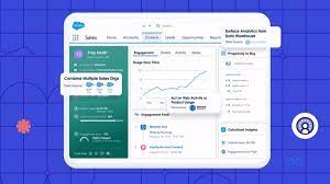
With Dynamic Components User Record Leads to Better UX
To streamline the user experience further, Robertson implemented filter conditions. Using logic to control when specific components appeared. When a donor intends to make a donation, additional fields appear for specifying details. If a coordinator is checking the record of an anonymous donor, irrelevant fields are hidden. This dynamic control of component visibility ensures users see what they need when they need it, reducing clutter.
The result of this redesign is a streamlined experience for coordinators who can now respond promptly to donors’ inquiries. They can easily access unified customer profiles. Profiles containing information on donation frequency, employer matching, previous communications, and more. This seemingly minor change in page layout has significantly improved user success. It has resolved pain points in the donor relations process. Thereby contributing to the organization’s overall strategies.
Robertson emphasized the collaborative nature of the team highlighting the satisfaction of making the work less stressful. For those ready to design page layouts that prioritize user experience, her insights provide valuable guidance on creating efficient and clutter-free interfaces.
Who is Salesforce? Here is their story in their own words. From our inception, we've proudly embraced the identity of Read more

Salesforce Marketing Cloud Transactional Emails are immediate, automated, non-promotional messages crucial to business operations and customer satisfaction, such as order Read more

Salesforce has unveiled a comprehensive analytics solution tailored for wealth managers, home office professionals, and retail bankers, merging its Financial Read more
AI plays a crucial role in propensity score estimation as it can discern underlying patterns between treatments and confounding variables Read more