5 Ways Marketing Intelligence Transforms Campaign Performance and ROI
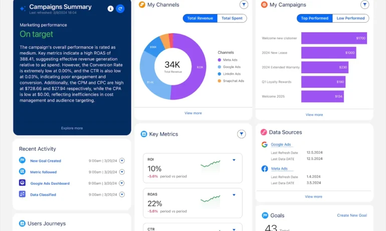
Struggling to prove marketing ROI? You’re not alone. Are you optimizing campaigns in real time—or just reacting to yesterday’s results? Can you confidently tie marketing spend to revenue, or are you relying on guesswork? If fragmented data, delayed insights, and wasted ad spend are holding you back, Salesforce Marketing Intelligence is the solution. This AI-powered analytics platform unifies your marketing data, automates optimizations, and delivers actionable insights—so you can boost performance, reduce waste, and maximize ROI. The Challenge: Turning Data into Revenue Today’s customer journey spans social, email, search, and more—but without clear insights, optimizing spend and proving impact is nearly impossible. Traditional analytics leave marketers with: Marketing Intelligence changes that. What Is Marketing Intelligence? Salesforce Marketing Intelligence is an AI-driven analytics solution that:✅ Unifies marketing data in real time✅ Automates optimizations with AI agents✅ Delivers actionable insights to improve ROI Built on Data Cloud, Tableau, and Einstein AI, it transforms raw data into smart, autonomous decisions—so you spend less time analyzing and more time executing high-impact strategies. 5 Breakthrough Innovations in Marketing Intelligence 1. AI-Powered Paid Media Optimization Autonomous agents analyze performance data 24/7, automatically: 2. Real-Time Performance Dashboard (Marketer Homepage) Get an instant, AI-summarized view of all campaigns—with alerts for underperforming ads and one-click optimizations. 3. AI Data Enrichment & Cleaning No more messy spreadsheets. AI standardizes and categorizes your data (e.g., grouping “Meta” and “Reddit” as “Social Channels”) for clearer insights. 4. 3-Click Data Integration Connect Google Ads, Meta, Shopify, CRM, and more in seconds with pre-built connectors—no coding needed. 5. End-to-End Attribution Tracking See the full customer journey—from first click to closed deal—with built-in first- and last-touch attribution. Marketing Intelligence in Action: A Retailer’s Success Story Your Garden Place (YGP), a sustainable home goods brand, used Marketing Intelligence to: Result: Higher conversions, lower wasted spend, and data-backed confidence in every decision. Stop Guessing. Start Optimizing. Marketing Intelligence eliminates the guesswork—giving you real-time insights, AI-driven optimizations, and closed-loop attribution—all on the Salesforce platform. Ready to transform your marketing performance? Reach out to Tectonic to explore Marketing Intelligence today. “A top priority for marketers is understanding performance in real time. Marketing Intelligence provides instant insights and autonomous actions—ensuring every dollar drives impact.”—Stephen Hammond, GM, Marketing Cloud Like Related Posts Salesforce OEM AppExchange Expanding its reach beyond CRM, Salesforce.com has launched a new service called AppExchange OEM Edition, aimed at non-CRM service providers. Read more The Salesforce Story In Marc Benioff’s own words How did salesforce.com grow from a start up in a rented apartment into the world’s Read more Salesforce Jigsaw Salesforce.com, a prominent figure in cloud computing, has finalized a deal to acquire Jigsaw, a wiki-style business contact database, for Read more Service Cloud with AI-Driven Intelligence Salesforce Enhances Service Cloud with AI-Driven Intelligence Engine Data science and analytics are rapidly becoming standard features in enterprise applications, Read more