Microsoft Power BI - gettectonic.com
How to Connect Multiple Data Sources in Power BI Desktop

How to Connect Multiple Data Sources in Power BI Desktop

In today’s data-driven world, the ability to analyze diverse data sources can set a business apart. With Power BI Desktop, a Microsoft tool, analysts can seamlessly integrate data from various platforms and transform raw information into actionable insights. For instance, you could combine Excel-based sales figures with financial data from SQL Server and customer information from Salesforce into an interactive report. Mastering these techniques can be easier through structured learning, such as Microsoft Power BI courses, which offer practical insights into leveraging this powerful tool. This guide will help you connect, combine, and visualize multiple data sources in Power BI Desktop to make smarter, data-driven decisions. Why Combine Multiple Data Sources? Organizations often face the challenge of managing data stored across disparate systems. Financial records may reside in SQL Server, sales data in Excel, and customer information in cloud platforms like Salesforce. Insights from these datasets are often hidden unless they are integrated. Using Power BI Desktop, you can load multiple data sources into a unified model, providing a comprehensive view that enables better analysis and decision-making. Getting Started with Power BI Desktop Before integrating datasets, ensure you have Power BI Desktop installed. The tool is available for download from the official Power BI website. Once installed, launch Power BI Desktop to begin connecting your data sources. Step-by-Step Guide 1. Connecting Your First Data Source Follow these steps to connect to your first data source: At this stage, you can use Power Query Editor to clean and transform the data as needed. 2. Adding Additional Data Sources Enhance your report by adding more data sources: For example, you could link an Excel file for sales data, a SQL Server database for product details, and Azure for supplementary information, all within a single report. 3. Combining Data from Multiple Sources To merge data from different sources into a cohesive model: This process creates a unified data model that allows for cross-tabulation and advanced visualizations. 4. Using Power Query Editor for Data Transformation Before combining datasets, you may need to clean and transform the data. Use Power Query Editor to: Access Power Query Editor by selecting Transform Data on the Home tab. 5. Creating Visualizations with Combined Data With your unified data model, you can create compelling visualizations: 6. Refreshing Data Connections Power BI Desktop enables you to refresh data connections effortlessly, ensuring your reports stay updated: Best Practices for Connecting Multiple Data Sources Conclusion Integrating multiple data sources in Power BI Desktop empowers businesses to uncover deep insights and make informed decisions. By following these steps, you can connect, aggregate, and visualize diverse datasets with ease. To further enhance your expertise, explore free resources or consider professional courses to master the versatility of Power BI Desktop—a vital tool for data professionals and business analysts. Like Related Posts Salesforce OEM AppExchange Expanding its reach beyond CRM, Salesforce.com has launched a new service called AppExchange OEM Edition, aimed at non-CRM service providers. Read more The Salesforce Story In Marc Benioff’s own words How did salesforce.com grow from a start up in a rented apartment into the world’s Read more Salesforce Jigsaw Salesforce.com, a prominent figure in cloud computing, has finalized a deal to acquire Jigsaw, a wiki-style business contact database, for Read more Health Cloud Brings Healthcare Transformation Following swiftly after last week’s successful launch of Financial Services Cloud, Salesforce has announced the second installment in its series Read more

Read More
Collaborative Business Intelligence

Collaborative Business Intelligence

Collaborative BI combines BI tools with collaboration platforms, enabling users to connect data insights directly within their existing workflows. This integration enhances decision-making by reducing misunderstandings and fostering teamwork through real-time or asynchronous discussions about data. In traditional BI, data analysis was handled by data scientists and statisticians who translated insights for business users. However, the rise of self-service BI tools has democratized data access, allowing users of varying technical skills to create and share visualizations. Collaborative BI takes this a step further by embedding BI functions into collaboration platforms like Slack and Microsoft Teams. This setup allows users to ask questions, clarify context, and share reports within the same applications they already use, enhancing data-driven decisions across the organization. One real-life time saver in my experience is being able as a marketer to dig in to our BI and generate lists myself, without depending upon a team of data scientists. Benefits of Collaborative BI Leading Collaborative BI Platforms Several vendors offer collaborative BI solutions, each with unique integrations for communication and data sharing: Collaborative BI bridges data analysis with organizational collaboration, creating an agile environment for informed decision-making and effective knowledge sharing across all levels. Like Related Posts Salesforce OEM AppExchange Expanding its reach beyond CRM, Salesforce.com has launched a new service called AppExchange OEM Edition, aimed at non-CRM service providers. Read more The Salesforce Story In Marc Benioff’s own words How did salesforce.com grow from a start up in a rented apartment into the world’s Read more Salesforce Jigsaw Salesforce.com, a prominent figure in cloud computing, has finalized a deal to acquire Jigsaw, a wiki-style business contact database, for Read more Health Cloud Brings Healthcare Transformation Following swiftly after last week’s successful launch of Financial Services Cloud, Salesforce has announced the second installment in its series Read more

Read More
Informed Decision-Making

Informed Decision-Making

Informed Decision-Making Through Data Visualization: Power BI vs. Tableau Today’s businesses need to make informed decisions by leveraging organized and analyzed data. Data visualization is a key method for extracting insights from this data, and Power BI and Tableau are two leading tools that often spark debate among experts. Both are highly regarded for their ability to visualize data, and CTOs frequently compare Power BI vs. Tableau to determine the best fit for their needs. Why Power BI and Tableau Stand OutBoth tools excel at data visualization, making them top choices for business intelligence (BI) solutions. They offer seamless integration with various platforms, can handle large volumes of data, and provide predictive analytics capabilities. To help CTOs and other decision-makers boost efficiency, let’s dive into a comparison of Power BI vs. Tableau and examine how each tool measures up. Power BI Microsoft’s Power BI is a leading BI tool designed to transform data from diverse sources into insightful visual reports. It allows users to create, share, and manage analytical reports, ensuring accessibility at all times. As part of the Microsoft ecosystem, Power BI is ideal for large organizations that already use Microsoft products. Tableau Tableau delivers powerful data visualization with flexible deployment options, allowing users to seamlessly access insights. With its integration into Salesforce Data Cloud, Tableau offers a fast and scalable way to work with customer data in real time. Its strong data-handling capabilities make it popular among larger organizations and data experts. Power BI vs. Tableau: Key Differences Let’s explore the key differences between Power BI and Tableau to guide your informed decision-making. Data Visualization and User Interface Data Integration and Connectivity for Informed Decision-Making Data Handling and Performance Ease of Learning Programming Tools Support Pricing Microsoft Power BI vs. Salesforce Tableau: Pros and Cons Power BI Pros Tableau Pros Which is Better: Power BI or Tableau? When comparing Microsoft Power BI vs. Tableau, the right choice depends on your organization’s size, technical expertise, and specific needs. For smaller businesses and those already using Microsoft tools, Power BI is often the best fit. On the other hand, larger organizations managing substantial datasets might favor Tableau for its advanced capabilities. Ultimately, the decision between Power BI vs. Tableau should be based on your unique business requirements and the level of technical expertise available within your team. Like Related Posts Salesforce OEM AppExchange Expanding its reach beyond CRM, Salesforce.com has launched a new service called AppExchange OEM Edition, aimed at non-CRM service providers. Read more The Salesforce Story In Marc Benioff’s own words How did salesforce.com grow from a start up in a rented apartment into the world’s Read more Salesforce Jigsaw Salesforce.com, a prominent figure in cloud computing, has finalized a deal to acquire Jigsaw, a wiki-style business contact database, for Read more Health Cloud Brings Healthcare Transformation Following swiftly after last week’s successful launch of Financial Services Cloud, Salesforce has announced the second installment in its series Read more

Read More
Collaborative Business Intelligence

Collaborative Business Intelligence

Collaborative Business Intelligence: Connecting Data and Teams In today’s data-driven world, the ability to interact with business intelligence (BI) tools is essential for making informed decisions. Collaborative business intelligence (BI), also known as social BI, allows users to engage with their organization’s data and communicate with data experts through the same platforms where they already collaborate. While self-service BI empowers users to generate insights, understanding the data’s context is critical to avoid misunderstandings that can derail decision-making. Collaborative BI integrates BI tools with collaboration platforms to bridge the gap between data analysis and communication, reducing the risks of misinterpretation. Traditional Business Intelligence Traditional BI involves the use of technology to analyze data and present insights clearly. Before BI platforms became widespread, data scientists and statisticians handled data analysis, making it challenging for non-technical professionals to digest the insights. BI evolved to automate visualizations, such as charts and dashboards, making data more accessible to business users. Previously, BI reports were typically available only to high-level executives. However, modern self-service BI tools democratize access, enabling more users—regardless of technical expertise—to create reports and visualize data, fostering better decision-making across the organization. The Emergence of Collaborative BI Collaborative BI is a growing trend, combining BI applications with collaboration tools. This approach allows users to work together synchronously or asynchronously within a shared platform, making it easier to discuss data reports in real time or leave comments for others to review. Whether it’s through Slack, Microsoft Teams, or social media apps, users can receive and discuss BI insights within their usual communication channels. This seamless integration of BI and collaboration tools offers a competitive edge, simplifying the process of sharing knowledge and clarifying data without switching between applications. Key Benefits of Collaborative Business Intelligence Leading Collaborative BI Platforms Here’s a look at some of the top collaborative BI platforms driving innovation in the market: Conclusion Collaborative BI empowers organizations by improving decision-making, democratizing data access, optimizing data quality, and ensuring data security. By integrating BI tools with collaboration platforms, businesses can streamline their operations, foster a culture of data-driven decision-making, and enhance overall efficiency. Choosing the right platform is key to maximizing the benefits of collaborative BI. Like Related Posts Salesforce OEM AppExchange Expanding its reach beyond CRM, Salesforce.com has launched a new service called AppExchange OEM Edition, aimed at non-CRM service providers. Read more The Salesforce Story In Marc Benioff’s own words How did salesforce.com grow from a start up in a rented apartment into the world’s Read more Salesforce Jigsaw Salesforce.com, a prominent figure in cloud computing, has finalized a deal to acquire Jigsaw, a wiki-style business contact database, for Read more Health Cloud Brings Healthcare Transformation Following swiftly after last week’s successful launch of Financial Services Cloud, Salesforce has announced the second installment in its series Read more

Read More
Power BI

Connect Salesforce and Power BI

Hello, Im trying to connect a filtered case list (https://company.lightning.force.com/lightning/o/Case/list?filterName=blahblah) containing customer reviews in the case description into a Power BI table and connect it to my AI Hub custom prompt bot that categorises text. Ideally, when new cases get added to that filtered list –  the Power BI table automatically refreshes with the case id, subject, description and an additional column where the categorised text gets added in. eg) Case ID Case Subject Case description Category 332432 AAAA blah blah customer complaint 4243242 BBBB something product quality 424234 CCCC bleh customer praise Thanks! You might find it helpful to follow these steps: 1. Connect Salesforce filtered case list to Power BI. 2. Use Power Apps AI Builder to categorise case descriptions: 3. Configure Power BI to automatically refresh for the latest classification results. 4. Displaying Classified Data in Power BI Like Related Posts Salesforce OEM AppExchange Expanding its reach beyond CRM, Salesforce.com has launched a new service called AppExchange OEM Edition, aimed at non-CRM service providers. Read more The Salesforce Story In Marc Benioff’s own words How did salesforce.com grow from a start up in a rented apartment into the world’s Read more Salesforce Jigsaw Salesforce.com, a prominent figure in cloud computing, has finalized a deal to acquire Jigsaw, a wiki-style business contact database, for Read more Health Cloud Brings Healthcare Transformation Following swiftly after last week’s successful launch of Financial Services Cloud, Salesforce has announced the second installment in its series Read more

Read More
Sales Forecast Report in Power BI

Sales Forecast Report in Power BI

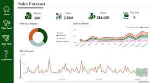
To predict future sales, a time series forecasting model was created in Power BI. The model used past sales data to predict sales for the next 15 days. Visuals were included to compare forecasts with actual sales, and the results closely aligned with historical trends.

Read More
Big Data and Data Visualization

Big Data and Data Visualization Explained

Data Visualization: Turning Complex Data into Clear Insights Data visualization is the practice of converting information into visual formats, such as maps or graphs, to make data more accessible and understandable. The primary purpose of data visualization is to highlight patterns, trends, and outliers within large data sets, allowing users to quickly glean insights. The term is often used interchangeably with information graphics, information visualization, and statistical graphics. The Role of Data Visualization in Data Science Data visualization is a crucial step in the data science process. After data is collected, processed, and modeled, it must be visualized to draw meaningful conclusions. It’s also a key component of data presentation architecture, a discipline focused on efficiently identifying, manipulating, formatting, and delivering data. Importance Across Professions Data visualization is essential across various fields. Teachers use it to display student performance, computer scientists to explore AI advancements, and executives to communicate information to stakeholders. In big data projects, visualization tools are vital for quickly summarizing large datasets, helping businesses make informed decisions. In advanced analytics, visualization is equally important. Data scientists use it to monitor and ensure the accuracy of predictive models and machine learning algorithms. Visual representations of complex algorithms are often easier to interpret than numerical outputs. Historical Context of Data Visualization Data visualization has evolved significantly over the centuries, long before the advent of modern technology. Today, its importance is more pronounced, as it enables quick and effective communication of information in a universally understandable manner. Why Data Visualization Matters Data visualization provides a straightforward way to communicate information, regardless of the viewer’s expertise. This universality makes it easier for employees to make decisions based on visual insights. Visualization offers numerous benefits for businesses, including: Advantages of Data Visualization Key benefits include: Challenges and Disadvantages Despite its advantages, data visualization has some challenges: Data Visualization in the Era of Big Data With the rise of big data, visualization has become more critical. Companies leverage machine learning to analyze vast amounts of data, and visualization tools help present this data in a comprehensible way. Big data visualization often employs advanced techniques, such as heat maps and fever charts, beyond the standard pie charts and graphs. However, challenges remain, including: Examples of Data Visualization Techniques Early computer-based data visualizations often relied on Microsoft Excel to create tables, bar charts, or pie charts. Today, more advanced techniques include: Common Use Cases for Data Visualization Data visualization is widely used across various industries, including: The Science Behind Data Visualization The effectiveness of data visualization is rooted in how humans process information. Daniel Kahneman and Amos Tversky’s research identified two methods of information processing: Visualization Tools and Vendors Data visualization tools are widely used for business intelligence reporting. These tools generate interactive dashboards that track performance across key metrics. Users can manipulate these visualizations to explore data in greater depth, and indicators alert them to data updates or important events. Businesses might use visualization of data software to monitor marketing campaigns or track KPIs. As tools evolve, they increasingly serve as front ends for sophisticated big data environments, assisting data engineers and scientists in exploratory analysis. Popular data visualization tools include Domo, Klipfolio, Looker, Microsoft Power BI, Qlik Sense, Tableau, and Zoho Analytics. While Microsoft Excel remains widely used, newer tools offer more advanced capabilities. Data visualization is a vital subset of the broader field of data analytics, offering powerful tools for understanding and leveraging business data across all sectors. Like Related Posts Salesforce OEM AppExchange Expanding its reach beyond CRM, Salesforce.com has launched a new service called AppExchange OEM Edition, aimed at non-CRM service providers. Read more The Salesforce Story In Marc Benioff’s own words How did salesforce.com grow from a start up in a rented apartment into the world’s Read more Salesforce Jigsaw Salesforce.com, a prominent figure in cloud computing, has finalized a deal to acquire Jigsaw, a wiki-style business contact database, for Read more Health Cloud Brings Healthcare Transformation Following swiftly after last week’s successful launch of Financial Services Cloud, Salesforce has announced the second installment in its series Read more

Read More
gettectonic.com