Overwhelmed by Dashboard Data? 4 Steps to Unlock the Right Marketing Insights

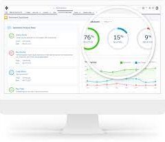
An effective dashboard should present marketing data clearly and concisely, enabling teams to quickly extract insights and make confident decisions. 4 Steps to Unlock the Right Marketing Insights
Turning Data into Action with Trusted Insights
Imagine walking into a restaurant with an overwhelming menu—dozens of dishes spanning multiple cuisines, making it difficult to choose. While the food may be good, the sheer volume of options leads to decision fatigue, causing diners to default to familiar choices rather than exploring new possibilities.
The same challenge applies to marketing dashboards. When cluttered with excessive metrics, they become difficult to navigate, obscuring key insights rather than revealing them. A well-designed dashboard, like a well-curated menu, should guide users to the most valuable information—helping them act quickly and strategically.
The Difference Between Reporting and Insights
Many dashboards fall into the trap of displaying every possible metric, but true value comes from actionable insights, not just raw data.
- Reporting answers “What happened?” (Descriptive, historical data)
- Insights answer “Why did it happen, and what should we do next?” (Actionable, forward-looking intelligence)
Example: A live campaign shows that email conversions outperform social ads. Instead of just noting the discrepancy, an insights-driven dashboard helps marketers diagnose why—perhaps stronger subject lines or better landing page alignment—and adjust social strategies in real time for immediate improvement.
4 Steps to Build Dashboards That Drive Decisions
To transform dashboards from data overload into insight engines, follow this structured approach:
1. Define the User Persona
Dashboards should cater to specific roles, not broad audiences. Different stakeholders need different insights:
- Marketing Executives optimize budgets across brands and regions.
- Brand Managers focus on campaign and product performance.
- Campaign Managers analyze channel and creative effectiveness.
A one-size-fits-all dashboard drowns users in irrelevant data. Instead, tailor views to each persona’s core needs.
2. Align with Daily Tasks
Collaborate with users to understand how they apply data in their workflows. A well-designed dashboard should:
- Reduce dependency on IT by letting users self-serve insights.
- Accelerate decision-making by surfacing the right metrics at the right time.
- Integrate seamlessly into existing processes, such as weekly performance reviews.
3. Answer Key Business Questions
Every dashboard should directly address the user’s most critical questions, such as:
- Which channels drive the highest conversions?
- Which creatives resonate best with our audience?
- Where should we reallocate underperforming spend?
Prioritize KPIs that drive action, like:
✔ Impressions (Reach)
✔ Click-through rate (CTR) (Engagement)
✔ Conversion rate (CVR) (Effectiveness)
✔ Revenue per sale (ROI)
Supplement these with supporting metrics (e.g., time on site, repeat visits) to uncover deeper trends.
4. Design for Clarity and Impact
A great dashboard balances simplicity with depth:
- Use questions as chart titles (e.g., “Which campaigns have the highest CAC?”).
- Link to detailed dashboards for deeper dives—keeping the main view clean.
- Pressure-test every element—remove anything that doesn’t drive decisions.
Example for Executives: A high-level dashboard showing revenue, CAC, and CLTV by region helps identify growth opportunities. If one region shows strong CLTV, leadership might invest further in similar markets.
The Result? Faster, Smarter Decisions
By focusing on personas, tasks, key questions, and clarity, marketers can move beyond data overload and unlock real business value. The best dashboards don’t just report numbers—they illuminate the path forward.
Ready to streamline your insights? Start by having Tectonic refine one dashboard using these steps—and watch decision-making improve.
🔔🔔 Follow us on LinkedIn 🔔🔔

