Line Charts: A Comprehensive Guide
Overview
Line charts are ideal for visualizing changes in values over time, such as weekly, quarterly, or monthly trends. They work best when you have:
- One primary grouping (e.g., time periods like months or quarters)
- One or more values to display (e.g., sales, leads, or record counts)
Availability
- Editions: Group, Professional, Enterprise, Performance, Unlimited, and Developer
- Platforms: Salesforce Classic and Lightning Experience
Types of Line Charts
1. Standard Line Chart
- Use case: Track changes in a single metric over time.
- Example: Plotting monthly lead counts with the X-axis as “Created Month” and the Y-axis as “Record Count.”
- Missing Data Handling: Gaps appear in the line if values are null.
2. Grouped Line Chart
- Use case: Compare multiple categories over time.
- Example: Tracking sales by different product categories across quarters.
3. Cumulative Line Chart
- Use case: Display the running total of a value over time.
- Example: Showing cumulative revenue growth quarter by quarter.
4. Grouped Cumulative Line Chart
- Use case: Compare cumulative totals across multiple categories.
- Example: Visualizing cumulative sales by region over a fiscal year.
Customizing Line Charts
In the Chart Editor, use the Customize tab to adjust:
1. Style
- Legend position (or hide it)
- Background and border colors
2. Series
- Display data labels (with position and color settings)
3. Horizontal Axis
- Title, number formatting, gridlines, and label orientation
4. Vertical Axis
- Title, scale adjustments, tick marks, number formatting, and gridlines
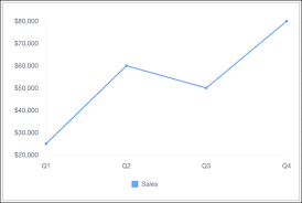
Sample Data & Use Case
| Quarter | Sales |
|---|---|
| Q1 | $25,000 |
| Q2 | $60,000 |
| Q3 | $50,000 |
| Q4 | $80,000 |
Example Visualization:
A line chart plotting quarterly sales trends.
Advanced Technique: Summed Line Graph
Task: Create a line graph where one line represents the total sum of all other lines.
Steps (Using Tableau Superstore Data Example)
- Drag “Order Date” to Columns → Right-click and select “Month (Continuous)”.
- Drag “Sales” to Rows twice (creates two identical measures).
- Right-click the second “SUM(Sales)” → Select “Dual Axis.”
- Right-click the right axis → Choose “Synchronize Axis.”
- Select the second “SUM(Sales)” on the Marks card → Drag “Category” to Color.
This creates a line chart with individual category trends and a summed total line.
Key Takeaways
- Line charts excel at time-series analysis.
- Use grouped or cumulative variations for multi-category or running totals.
- Customize axes, labels, and styles for clarity.
- Advanced techniques (like dual-axis charts) enable summed trend visualization.
Who is Salesforce? Here is their story in their own words. From our inception, we've proudly embraced the identity of Read more

Salesforce Marketing Cloud Transactional Emails are immediate, automated, non-promotional messages crucial to business operations and customer satisfaction, such as order Read more

Salesforce has unveiled a comprehensive analytics solution tailored for wealth managers, home office professionals, and retail bankers, merging its Financial Read more

AI plays a crucial role in propensity score estimation as it can discern underlying patterns between treatments and confounding variables Read more