In 2022, when Fordham University revamped its student advising app, appointment bookings doubled, thanks to a human-centered design approach. Anand Padmanabhan, Fordham University VP and CIO, emphasized the shift towards involving users in the design process, which led to enhanced app adoption and shared trust among stakeholders. App Engagement With Human-Centered Design was achieved by putting students first.
The Fordham Student Success Hub app underwent significant changes to replace inefficient processes like long email chains for scheduling appointments. The new app facilitated over 15,000 appointment bookings, demonstrating its effectiveness.
App Engagement With Human-Centered Design prioritizes identifying user needs and crafting solutions that address those needs directly. For Fordham University’s project, the team engaged with a diverse user group, including over 2,000 freshmen, 400 advisors, and support staff. This approach led to clear objectives: students wanted easy appointment booking, while advisors sought tools to identify at-risk students based on specific criteria.
Katherine Gomez, Fordham’s assistant director of core applications, applied the Jobs to Be Done framework to understand user goals. Leveraging the Student Success App in Education Cloud and partnering with Attain Partners, enhancements were made to advisor assignment, alert management, and success analytics.
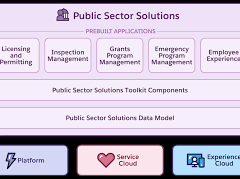
Integration of Service Cloud, Experience Cloud, and Marketing Cloud streamlined app efficiency. Business rules were established to ensure an intuitive user experience with minimal custom coding.
Visual design was driven by common use cases, ensuring critical features were accessible on the first page. Sara Sapienza, Fordham University Digital Campus Experience Manager, utilized Salesforce Lightning Design System Figma library to design the user interface and iteratively refined the design based on user feedback.
The app was tailored to address specific user needs:
- Students could quickly identify and book appointments with advisors.
- Advisors received alerts on at-risk students and urgent tasks, reducing guesswork.
Continuous user feedback guided UX optimizations, including language clarity, button formatting, and personalized greetings upon login. Emojis were incorporated into notifications to engage Gen Z users effectively.
The success of the app extended beyond appointments, attracting interest from other academic departments like Prestigious Awards and Campus Ministry.
In summary, Fordham University’s success story underscores the importance of human-centered design in creating user-friendly apps that meet diverse user needs and foster broader engagement across academic services. The journey continues with plans to expand app access to all undergraduates and graduate students, driving student success and organizational efficiency.


