Better Tableau Dashboard Design Tips. Eight strategies for crafting engaging and delightful Tableau dashboards:
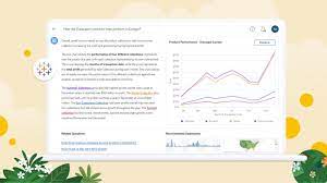
- Add Interactivity for Exploration: Understand your audience and incorporate interactive features that allow them to drill down to the specific information they need.
- Utilize Filters: Leverage the power of filters to queue up specific views for side-by-side analysis. Filters enhance engagement by allowing your audience to customize their dashboard experience.
- Include Filter Cards: Display Filter Cards presenting different types of data, such as multi-select checkboxes, single select radio buttons, or drop-down lists. Provide clear instructions for interaction to enhance viewer understanding.
- Implement Highlight Actions: Enhance interactivity with Highlight Actions, where selecting an item in one view highlights related data in other views. For advanced scenarios, explore Set Actions or Parameter Actions for deeper levels of engagement.
- Limit Views: Resist the temptation to overcrowd your dashboard with numerous views. Stick to two or three key views to maintain focus on the big picture. If necessary, create additional dashboards or use a storytelling approach.
- Use Color Thoughtfully: Apply color judiciously, avoiding an overload of hues. Effective use of color enhances analysis, while excessive colors can hinder comprehension. Opt for a consistent color scheme to improve viewer understanding.
- Design for Screen Size: Prioritize the most crucial Key Performance Indicators (KPIs) for smaller screens. When designing for mobile devices, ensure elements are easy to click and limit unnecessary interactivity for optimal user experience.
- Enable Fast Loading: Avoid disengaging users with slow-loading dashboards. Optimize loading times by identifying and addressing issues in data or dashboard design. Utilize database calculations to reduce overhead and consider data extracts for faster loading, especially during prototyping. Keep in mind that live connections may be more suitable for constantly-refreshing data in the long run.
Creating dashboards using Tableau Dashboard Design Tips makes for better user experience.
“It’s easy to be distracted by formatting and finding the perfect color, size, and position for elements. It’s best to do this towards the end, after reviews by the end users, to not waste effort because entire charts suddenly change and all formatting is lost.”
ALEXANDER WALECZEK, ANALYTICS PRACTICE LEAD AND TABLEAU AMBASSADOR


