The effort made to build better Tableau dashboards pays tenfold in there readability and usability.
“Dashboard design is not about making dashboards ‘pretty. It’s making them functional and helping the user to get the information they need as efficiently as possible.”
ALEXANDER WALECZEK, ANALYTICS PRACTICE LEAD AND TABLEAU AMBASSADOR
Effective communication with your audience involves considering their needs from start to finish. The key lies in posing the right questions. To convey information to your readers in an engaging manner, it is crucial to grasp fundamental aspects, such as:
- What specific information does my audience require?
- How frequently will they refer to this data?
- What existing knowledge do they possess about the subject?
- Are they familiar with dashboard usage?
Possibly, when tailoring content for a time-pressed salesperson with only 15 seconds to spare for crucial performance indicators, it is imperative to present the most vital information in a glance. Additionally, ensuring that the dashboard is mobile-friendly and loads swiftly becomes essential. On the other hand, if your target audience consists of a team set to review quarterly dashboards over an extended period, offering more detailed views of the data might be advisable.
Build Better Tableau Dashboards for Your Audience
Take into account the expertise level of your audience. Gain a deeper understanding of their skill set by inquiring about their priorities and data consumption habits. This insight is crucial for determining the most effective way to present data, guiding key design decisions. For instance, a novice may require more action-oriented labels for filters or parameters compared to an advanced user. Here are four effective methods to assess the dashboard and data proficiency of your audience:
- Informal conversation: Engage in a casual discussion to gauge their familiarity with data concepts and comfort using data analysis tools.
- Request examples: Solicit information about data-related projects they’ve undertaken to evaluate their proficiency in working with data.
- Task-based evaluation: Assign a straightforward data analysis or visualization task and assess their approach and output.
- Learning interest: Gauge their enthusiasm for learning by inquiring about their interest in data-related training and participation in data communities.
Adjust Your Narrative
Adjust your narrative accordingly. Tailoring your dashboards to suit the intended audience enhances their impact. Below are three visualizations depicting the distribution of tornadoes in the United States for the first nine months of the year.
The distinction lies in the level of visual information employed to convey the narrative. There might e an extremely minimal presentation, progressing in complexity towards the right. None of these approaches is inherently superior to the others. The minimal visualization on the left might be ideal for audiences well-versed in the subject matter, appreciating simplicity and the elimination of redundancy. On the other hand, for newcomers or individuals viewing the visualization just once, the explicitness of the visualization on the right could be more effective.
Determining what constitutes clutter versus essential information is where collaboration with colleagues becomes crucial. Crafting persuasive dashboards involves making a lasting impact on partnership. By closely collaborating with line-of-business stakeholders, you can secure the buy-in and engagement needed to tailor the dashboard to their specific requirements and expectations. This collaborative approach forms the essence of dashboard persuasion.
A Work in Progress
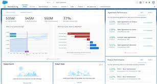
Demonstrate your process and embrace iterative refinement. Establishing a culture of analytics should be accompanied by a culture of supportive and frequent critique. Creating multiple versions of your work and actively seeking feedback throughout the process will contribute to a superior final product. Avoid isolation and stagnation; share your progress with others, use the feedback to refine your work, and repeat the process until you achieve a satisfactory result. Much like the formation of a diamond requiring extraordinary heat, pressure, and time, the outcome is worth the effort.
Encouraging critiques is essential for cultivating a culture of constructive feedback. Trust among colleagues is important, arguably it enables mutual respect and trust in each other’s feedback. Developing a thick skin is also necessary, focusing on designing dashboards that cater to users and clients’ needs rather than personal preferences. Similar to writers who must “kill their darlings,” designers must prioritize the overall effectiveness of the dashboard, making honest assessments and adjustments when needed.
“It also helps to have a public place—on a real or virtual wall—for sharing work. Making work public creates constant opportunities for feedback and improvements.”
Tableau
🔔🔔 Follow us on LinkedIn 🔔🔔


