Sprucing Up Your Salesforce Page Layouts: A Humorous Guide to Winning User Hearts and Ensuring Data Quality
Sometimes, the simplest tweaks can make the biggest difference. Modifications to your page layouts are no exception. In the world of Salesforce, page layouts are your tool of trade—what users see and interact with every day. Nailing these layouts can skyrocket user adoption and improve data quality, which is our ultimate mission as admins. So, here are some tips to help you jazz up those Salesforce page layouts.
Field Order: The Logic Puzzle
Think of field order like arranging your fridge. You wouldn’t put the milk behind the broccoli, right? Make sure your most important fields are front and center, not hidden in the dark corners of the page. Group like data wherever possible, and use sections.
Balance: Channel Your Inner Zen
Balance your fields like a feng shui master. If you have 8 fields on the left and 2 on the right, spread them out evenly. This not only makes the page look good but also makes it easier to use. And hey, use those blank spaces to keep things orderly.
Sections: The Organizational Guru
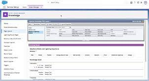
Break your page into sections like a pro organizer. To add new sections, click “edit layout,” drag the section field onto the page, fill in the section properties, and then drag related fields into their new cozy home. Organizing sections gives you the most storage space, just like cleaning out your closet.

Large Text Areas: Give Them Room to Breathe
Think of large text areas like your favorite novel—they deserve their own spotlight. Displaying 6 or more visible lines makes them easier to read and enjoy.
Consistency: The Familiar Friend
Consistency is key. Keep your layouts uniform to reduce the learning curve for users. For instance, always place the Owner, Created By, and Last Modified By fields at the bottom in a section called “System Information.”
Help Text: The Friendly Guide
Always use help text for custom fields. If you forgot to add it initially, no worries! Navigate to the custom field in the setup menu, click “edit,” and fill in the description and help text. Users really appreciate it and it can save you hours answering the same questions over and over again.
Lookup Filters: The Selector’s Best Friend
Decide if your lookups need filters. Filters are like bouncers at a club—they help users pick the right record, filtering out the riffraff like closed lost opportunities.
Required Fields: The Necessary Nuisance
Be judicious with required fields. If a field should be mandatory, decide if it should be universally required or just on the page layout. Err on the side of fewer universally required fields. To make a field required on the page layout, go to the page layout, click “edit layout,” hover over the field, click the wrench icon, and check “required.”
Search Layouts: The Sleuth’s Toolkit
Update search layouts to provide users with the info they need at a glance. Keep them consistent with list views. To edit search layouts, navigate to setup > the object (e.g., account, leads, contacts) > search layouts, and click “edit” next to search results. Select the fields you want and arrange them as desired.
Related Lists: The VIPs
Place custom related lists above the standard ones. Custom lists are like VIPs—they get the prime spots because they’re used more often.
List Views: The Window to Relevance
Update list views to display relevant details. Showing pertinent fields will save users from excessive clicking and scrolling.
Mini Page Layouts: The Compact Helper
Customize mini page layouts to show the most relevant information. Click “edit layout,” then “mini page layout,” add the relevant fields, and click “save.”
Mobile Optimization: The On-the-Go Champion
Remember that changes to Salesforce page layouts on your desktop also apply to mobile devices. Given the smaller screens, it’s smart to set up specific layouts for mobile. Navigate to setup > object (e.g., Account) > page layout, then click “new.” Clone an existing layout or start fresh, name it, and click “save.” Drag and drop the fields you want for mobile, then save again. Update the assignment by clicking “Page Layout Assignment,” then “Edit Assignment,” and assign the new layout to the mobile user profile.
User Communication and Collaboration: The Team Effort
Before making changes, give users a heads-up. Nobody likes surprises, especially when it comes to their workspace. Involve users in the update process and get their input. Use this time to tidy up fields and data. After collaborating, roll out a communication plan to ensure everyone knows about the changes and is prepared for questions.
These tips are designed to make the Salesforce experience smoother and more enjoyable by optimizing page layouts. Got your own tips? Share them in the comments below!


