Salesforce Tableau - gettectonic.com
Tableau Einstein Alliance to Help Partners Drive Success in the Agent Era

Tableau Einstein Alliance to Help Partners Drive Success in the Agent Era

Salesforce Unveils Tableau Einstein Alliance to Empower Partners in the AI-Driven Agent Era Salesforce today announced the launch of the Tableau Einstein Alliance, a new partner community designed to create and deliver AI-driven solutions and analytical agents for Tableau Einstein. Built on the Salesforce platform and integrated with Agentforce, this initiative aims to help partners accelerate success in the emerging AI landscape. Tableau Einstein Alliance to Help Partners Drive Success in the Agent Era The Tableau Einstein Alliance offers partners a range of exclusive benefits, including early access to Salesforce’s product roadmaps, in-house AI experts, marketing support, and co-selling opportunities. Through the Alliance, partners will be able to develop agents, apps, and AI-driven solutions, enabling customers to navigate the autonomous AI revolution and rapidly extract value from their data and AI investments. The Alliance is set to launch in February 2025 with 25 founding members, including Tectonic, Capgemini, Deloitte, IBM, and Slalom. Solutions developed within the Alliance will be available on both the Salesforce AppExchange and the forthcoming Tableau Marketplace, offering developers a platform to create, share, and monetize analytical assets. Why It Matters:Partner ecosystems have been crucial in advancing major technological innovations, from cloud computing to software-as-a-service. With the rise of Agentforce, building a dynamic partner community is more critical than ever to drive the next wave of AI and analytics adoption. Salesforce’s Perspective: “Tableau’s success is deeply rooted in our partners’ commitment to our customers. Now, we’re investing in the Tableau Einstein Alliance to cultivate an ecosystem of visionary and innovative partners who will integrate Agentforce into every facet of analytics. The future of data and analytics is here, and our partners are essential to this journey.”— Ryan Aytay, CEO, Tableau Industry Perspectives: “Atrium has championed the vision of unified analytics since Tableau joined the Salesforce ecosystem. We’ve seen the incredible potential of Data Cloud and Tableau Cloud together, and we’re thrilled to help bring Tableau Einstein to market. Its integrated features will offer customers unprecedented productivity.”— Chris Heineken, CEO, Atrium “Tectonic’s “Insight to Action” methodology (i2a) is directly improved by the launch of the Tableau Einstein Alliance. By utilizing automated AI-solutions to power data-driven insights, we are able to deliver additional value to our customers.”— Dan Grossnickle, Tectonic “Tableau Einstein represents the next step in Salesforce’s data platforms and generative AI products. The value for clients from these data-driven insights is immense. We’re excited to help lead the way through the Tableau Einstein Alliance.”— Jean-Marc Gaultier, Head of Group Strategic Initiatives and Partnerships, Capgemini “Deloitte has long benefited from Tableau’s capabilities, and we’re excited to see how this next iteration will further empower our teams with data to drive growth. Integrating key features into tools like Salesforce and Slack will unlock even greater potential for us.”— Moritz Schieder, Tableau Alliance Leader and Director, Deloitte Germany “IBM is eager to leverage Tableau Einstein to deliver more value to our customers, regardless of where they work. As a strategic Agentforce partner and Salesforce customer, we are excited to be part of the next generation of analytics alongside Salesforce.”— Mary Rowe, Global Head of IBM Consulting Salesforce Practice Tableau Einstein Alliance to Help Partners Drive Success in the Agent Era and Tectonic, an insights 2 actions company, is excited to be a part of the innovation. Like Related Posts Salesforce OEM AppExchange Expanding its reach beyond CRM, Salesforce.com has launched a new service called AppExchange OEM Edition, aimed at non-CRM service providers. Read more The Salesforce Story In Marc Benioff’s own words How did salesforce.com grow from a start up in a rented apartment into the world’s Read more Salesforce Jigsaw Salesforce.com, a prominent figure in cloud computing, has finalized a deal to acquire Jigsaw, a wiki-style business contact database, for Read more Health Cloud Brings Healthcare Transformation Following swiftly after last week’s successful launch of Financial Services Cloud, Salesforce has announced the second installment in its series Read more

Read More
Collaborative Business Intelligence

Collaborative Business Intelligence

Collaborative Business Intelligence: Connecting Data and Teams In today’s data-driven world, the ability to interact with business intelligence (BI) tools is essential for making informed decisions. Collaborative business intelligence (BI), also known as social BI, allows users to engage with their organization’s data and communicate with data experts through the same platforms where they already collaborate. While self-service BI empowers users to generate insights, understanding the data’s context is critical to avoid misunderstandings that can derail decision-making. Collaborative BI integrates BI tools with collaboration platforms to bridge the gap between data analysis and communication, reducing the risks of misinterpretation. Traditional Business Intelligence Traditional BI involves the use of technology to analyze data and present insights clearly. Before BI platforms became widespread, data scientists and statisticians handled data analysis, making it challenging for non-technical professionals to digest the insights. BI evolved to automate visualizations, such as charts and dashboards, making data more accessible to business users. Previously, BI reports were typically available only to high-level executives. However, modern self-service BI tools democratize access, enabling more users—regardless of technical expertise—to create reports and visualize data, fostering better decision-making across the organization. The Emergence of Collaborative BI Collaborative BI is a growing trend, combining BI applications with collaboration tools. This approach allows users to work together synchronously or asynchronously within a shared platform, making it easier to discuss data reports in real time or leave comments for others to review. Whether it’s through Slack, Microsoft Teams, or social media apps, users can receive and discuss BI insights within their usual communication channels. This seamless integration of BI and collaboration tools offers a competitive edge, simplifying the process of sharing knowledge and clarifying data without switching between applications. Key Benefits of Collaborative Business Intelligence Leading Collaborative BI Platforms Here’s a look at some of the top collaborative BI platforms driving innovation in the market: Conclusion Collaborative BI empowers organizations by improving decision-making, democratizing data access, optimizing data quality, and ensuring data security. By integrating BI tools with collaboration platforms, businesses can streamline their operations, foster a culture of data-driven decision-making, and enhance overall efficiency. Choosing the right platform is key to maximizing the benefits of collaborative BI. Like Related Posts Salesforce OEM AppExchange Expanding its reach beyond CRM, Salesforce.com has launched a new service called AppExchange OEM Edition, aimed at non-CRM service providers. Read more The Salesforce Story In Marc Benioff’s own words How did salesforce.com grow from a start up in a rented apartment into the world’s Read more Salesforce Jigsaw Salesforce.com, a prominent figure in cloud computing, has finalized a deal to acquire Jigsaw, a wiki-style business contact database, for Read more Health Cloud Brings Healthcare Transformation Following swiftly after last week’s successful launch of Financial Services Cloud, Salesforce has announced the second installment in its series Read more

Read More
Leeds and Other Heatmap Solutions

Leeds and Other Heatmap Solutions

With over 80% of people shopping online – and the numbers are bound to rise – it’s important to know how your would-be customers behave on your website: where they click, how they scroll, and what motivates them to take specific actions. Heatmap analytics does it, allowing you to dominate CRO and UX through effective behavior data interpretation. This insight will look at Leeds and Other Heatmap Solutions. Powered by heatmap software and heatmap tools, heatmap analytics can help you convert customers at scale by optimizing their on-site and mobile experience. Make no mistake: the quality of user behavior tracking can make a difference between a closed sale and a bounce. Leads Heatmap Software is an innovative tool that transforms complex lead data into easy-to-understand, color-coded heatmaps within Salesforce CRM. This solution uses advanced data visualization techniques, enabling users to quickly identify high-potential leads. Interactive Heatmaps Leverage dynamic, real-time heatmaps to visualize lead density and quality, making it easier to pinpoint high-potential areas. Real-Time Updates Stay up-to-date with the latest information as heatmaps automatically refresh with new leads or changes to existing data, ensuring you always have the most current view. Enhanced Analytics Dive deeper into lead behavior and trends with comprehensive analytics tools that provide detailed reports and predictive insights. Detailed Lead Profiles Access in-depth lead profiles directly from the heatmap, including contact details, engagement history, and quick shortcuts for a complete view of each lead. Online Chat Integration Interact with leads instantly using integrated online chat, facilitating immediate and personalized communication. All website pages have a purpose, whether that purpose is to drive further clicks, qualify visitors, provide a solution, or even a mix of all of those things. Heatmaps and recorded user sessions allow you to see if your page is serving that purpose or going against it. What Is a Heatmap? Generally speaking, heatmaps are graphical representations of data that highlight value with color. On a website heatmap, the most popular areas are showcased in red (hot) and the least popular are in blue (cold). The colors range on a scale from red to blue. Heatmaps are an excellent method of collecting user behavior data and converting it into a deep analysis of how visitors engage with your website pages. It can analyze: That information will help you identify user trends and key into what should be optimized to up engagement. Setting up website heatmapping software is a great start to refining your website design process and understanding your users. When to Use Heatmaps The truth is that heatmaps can actually be invaluable when testing and optimizing user experiences and conversion opportunities. There are many times you should be using them. Redesigning Your Website Updating, or even upgrading, your website isn’t just a task on your to do list. Careful thought, attention, and creativity should be put into the revamp if you want it to be worth the time and resources. Heatmaps can help with studying your current design to identify what your visitors are engaging with and what they’re ignoring. You’ll be tapped into what makes your visitors tick so that you can build a site meant specifically for your unique audience. Analyzing Webpage Conversions Trying to figure out why certain pages aren’t converting the way you thought they would? Use a heatmap. You’ll be able to identify exactly what’s attracting attention and deduce why. The same goes for buttons and pages that are showing a higher rate of conversion than anticipated. By keying into the design, copy, and other elements that are working for you, you’ll know exactly how to optimize your under-performing webpages. Testing New Updates As your business grows and you develop new ideas, naturally you’ll want to test them. A/B testing allows you to measure and analyze visitor response to a project or design, but you can take it a step further with heatmapping. Leverage the data graph by examining exactly what captures your visitors’ attention. At the end of the testing period, you may be able to pull designs or elements that received high levels of engagement from the page that didn’t perform as well into the successful one. How To Analyze Visually Using the color-coded visualizations, you can read your webpage for engagement levels and attention “hot spots.” Where the map reads red, that’s where visitors are showing the highest points of interactivity. Blue reflects low numbers. You can spot design issues or opportunities to move buttons, forms, and the like with a visual read. Data Points Reviewing raw data tables will give you more specific insights into your page’s performance. You can examine HTML elements and pixel locations of clicks to really understand what’s drawing people in. You can even filter your clicks and views in order of popularity with certain software. This takes the guessing out of your redesign and testing efforts. Tableau has instant, real-time reporting in place for users looking for actionable insights. With smart dashboards and a drag and drop interface, navigating the product is easy. Their cloud storage means omni-channel data access from anywhere. You can perform ad hoc analyses whenever it’s convenient for you. You can also share your reports with anyone to boost business impact. With built in A/B testing and consolidated heatmaps, Freshmarketer puts in the extra effort to plot out visitor interactions. Recorded in real time, you can analyze heatmaps based by device, which the software automatically detects. Offering scrollmaps and click maps, Freshmarketer strives to “go beyond traditional heatmaps.” Looker offers similar services to the other software options listed, but they also supply a unique security management feature to protect your data. Also partnered with Google Cloud, you’ll have access to reporting from anywhere in the world. Primarily a data analysis solution, you’ll have access to other data intelligence and visualization features as well. Hotjar is one of the most popular website analytics software suites, offering free heatmaps for desktop, mobile, and tablet within its basic subscription plan. You can create heatmaps and synergize them with other free features like user session recordings, surveys, and

Read More
Generative AI for Tableau

Generative AI for Tableau

Tableau’s first generative AI assistant is now generally available. Generative AI for Tableau brings data prep to the masses. Earlier this month, Tableau launched its second platform update of 2024, announcing that its first two GenAI assistants would be available by the end of July, with a third set for release in August. The first of these, Einstein Copilot for Tableau Prep, became generally available on July 10. Tableau initially unveiled its plans to develop generative AI capabilities in May 2023 with the introduction of Tableau Pulse and Tableau GPT. Pulse, an insight generator that monitors data for metric changes and uses natural language to alert users, became generally available in February. Tableau GPT, now renamed Einstein Copilot for Tableau, moved into beta testing in April. Following Einstein Copilot for Tableau Prep, Einstein Copilot for Tableau Catalog is expected to be generally available before the end of July. Einstein Copilot for Tableau Web Authoring is set to follow by the end of August. With these launches, Tableau joins other data management and analytics vendors like AWS, Domo, Microsoft, and MicroStrategy, which have already made generative AI assistants generally available. Other companies, such as Qlik, DBT Labs, and Alteryx, have announced similar plans but have not yet moved their products out of preview. Tableau’s generative AI capabilities are comparable to those of its competitors, according to Doug Henschen, an analyst at Constellation Research. In some areas, such as data cataloging, Tableau’s offerings are even more advanced. “Tableau is going GA later than some of its competitors. But capabilities are pretty much in line with or more extensive than what you’re seeing from others,” Henschen said. In addition to the generative AI assistants, Tableau 2024.2 includes features such as embedding Pulse in applications. Based in Seattle and a subsidiary of Salesforce, Tableau has long been a prominent analytics vendor. Its first 2024 platform update highlighted the launch of Pulse, while the final 2023 update introduced new embedded analytics capabilities. Generative AI assistants are proliferating due to their potential to enable non-technical workers to work with data and increase efficiency for data experts. Historically, the complexity of analytics platforms, requiring coding and data literacy, has limited their widespread adoption. Studies indicate that only about one-quarter of employees regularly work with data. Vendors have attempted to overcome this barrier by introducing natural language processing (NLP) and low-code/no-code features. However, NLP features have been limited by small vocabularies requiring specific business phrasing, while low-code/no-code features only support basic tasks. Generative AI has the potential to change this dynamic. Large language models like ChatGPT and Google Gemini offer extensive vocabularies and can interpret user intent, enabling true natural language interactions. This makes data exploration and analysis accessible to non-technical users and reduces coding requirements for data experts. In response to advancements in generative AI, many data management and analytics vendors, including Tableau, have made it a focal point of their product development. Tech giants like AWS, Google, and Microsoft, as well as specialized vendors, have heavily invested in generative AI. Einstein Copilot for Tableau Prep, now generally available, allows users to describe calculations in natural language, which the tool interprets to create formulas for calculated fields in Tableau Prep. Previously, this required expertise in objects, fields, functions, and limitations. Einstein Copilot for Tableau Catalog, set for release later this month, will enable users to add descriptions for data sources, workbooks, and tables with one click. In August, Einstein Copilot for Tableau Web Authoring will allow users to explore data in natural language directly from Tableau Cloud Web Authoring, producing visualizations, formulating calculations, and suggesting follow-up questions. Tableau’s generative AI assistants are designed to enhance efficiency and productivity for both experts and generalists. The assistants streamline complex data modeling and predictive analysis, automate routine data prep tasks, and provide user-friendly interfaces for data visualization and analysis. “Whether for an expert or someone just getting started, the goal of Einstein Copilot is to boost efficiency and productivity,” said Mike Leone, an analyst at TechTarget’s Enterprise Strategy Group. The planned generative AI assistants for different parts of Tableau’s platform offer unique value in various stages of the data and AI lifecycle, according to Leone. Doug Henschen noted that the generative AI assistants for Tableau Web Authoring and Tableau Prep are similar to those being introduced by other vendors. However, the addition of a generative AI assistant for data cataloging represents a unique differentiation for Tableau. “Einstein Copilot for Tableau Catalog is unique to Tableau among analytics and BI vendors,” Henschen said. “But it’s similar to GenAI implementations being done by a few data catalog vendors.” Beyond the generative AI assistants, Tableau’s latest update includes: Among these non-Copilot capabilities, making Pulse embeddable is particularly significant. Extending generative AI capabilities to work applications will make them more effective. “Embedding Pulse insights within day-to-day applications promises to open up new possibilities for making insights actionable for business users,” Henschen said. Multi-fact relationships are also noteworthy, enabling users to relate datasets with shared dimensions and informing applications that require large amounts of high-quality data. “Multi-fact relationships are a fascinating area where Tableau is really just getting started,” Leone said. “Providing ways to improve accuracy, insights, and context goes a long way in building trust in GenAI and reducing hallucinations.” While Tableau has launched its first generative AI assistant and will soon release more, the vendor has not yet disclosed pricing for the Copilots and related features. The generative AI assistants are available through a bundle named Tableau+, a premium Tableau Cloud offering introduced in June. Beyond the generative AI assistants, Tableau+ includes advanced management capabilities, simplified data governance, data discovery features, and integration with Salesforce Data Cloud. Generative AI is compute-intensive and costly, so it’s not surprising that Tableau customers will have to pay extra for these capabilities. Some vendors are offering generative AI capabilities for free to attract new users, but Henschen believes costs will eventually be incurred. “Customers will want to understand the cost implications of adding these new capabilities,”

Read More
summer 24 analytics release notes

Summer 24 Analytics Release Notes

Analytics summer 24 enhancements include new and updated features for Lightning reports and dashboards, Data Cloud reports and dashboards, CRM Analytics, Intelligent apps, and Tableau. Summer 24 Analytics Release Notes. Like Related Posts Salesforce OEM AppExchange Expanding its reach beyond CRM, Salesforce.com has launched a new service called AppExchange OEM Edition, aimed at non-CRM service providers. Read more The Salesforce Story In Marc Benioff’s own words How did salesforce.com grow from a start up in a rented apartment into the world’s Read more Salesforce Jigsaw Salesforce.com, a prominent figure in cloud computing, has finalized a deal to acquire Jigsaw, a wiki-style business contact database, for Read more Health Cloud Brings Healthcare Transformation Following swiftly after last week’s successful launch of Financial Services Cloud, Salesforce has announced the second installment in its series Read more

Read More
crm analytics

Build Better Tableau Dashboards

The effort made to build better Tableau dashboards pays tenfold in there readability and usability. “Dashboard design is not about making dashboards ‘pretty. It’s making them functional and helping the user to get the information they need as efficiently as possible.” ALEXANDER WALECZEK, ANALYTICS PRACTICE LEAD AND TABLEAU AMBASSADOR Effective communication with your audience involves considering their needs from start to finish. The key lies in posing the right questions. To convey information to your readers in an engaging manner, it is crucial to grasp fundamental aspects, such as: Possibly, when tailoring content for a time-pressed salesperson with only 15 seconds to spare for crucial performance indicators, it is imperative to present the most vital information in a glance. Additionally, ensuring that the dashboard is mobile-friendly and loads swiftly becomes essential. On the other hand, if your target audience consists of a team set to review quarterly dashboards over an extended period, offering more detailed views of the data might be advisable. Build Better Tableau Dashboards for Your Audience Take into account the expertise level of your audience. Gain a deeper understanding of their skill set by inquiring about their priorities and data consumption habits. This insight is crucial for determining the most effective way to present data, guiding key design decisions. For instance, a novice may require more action-oriented labels for filters or parameters compared to an advanced user. Here are four effective methods to assess the dashboard and data proficiency of your audience: Adjust Your Narrative Adjust your narrative accordingly. Tailoring your dashboards to suit the intended audience enhances their impact. Below are three visualizations depicting the distribution of tornadoes in the United States for the first nine months of the year. The distinction lies in the level of visual information employed to convey the narrative. There might e an extremely minimal presentation, progressing in complexity towards the right. None of these approaches is inherently superior to the others. The minimal visualization on the left might be ideal for audiences well-versed in the subject matter, appreciating simplicity and the elimination of redundancy. On the other hand, for newcomers or individuals viewing the visualization just once, the explicitness of the visualization on the right could be more effective. Determining what constitutes clutter versus essential information is where collaboration with colleagues becomes crucial. Crafting persuasive dashboards involves making a lasting impact on partnership. By closely collaborating with line-of-business stakeholders, you can secure the buy-in and engagement needed to tailor the dashboard to their specific requirements and expectations. This collaborative approach forms the essence of dashboard persuasion. A Work in Progress Demonstrate your process and embrace iterative refinement. Establishing a culture of analytics should be accompanied by a culture of supportive and frequent critique. Creating multiple versions of your work and actively seeking feedback throughout the process will contribute to a superior final product. Avoid isolation and stagnation; share your progress with others, use the feedback to refine your work, and repeat the process until you achieve a satisfactory result. Much like the formation of a diamond requiring extraordinary heat, pressure, and time, the outcome is worth the effort. Encouraging critiques is essential for cultivating a culture of constructive feedback. Trust among colleagues is important, arguably it enables mutual respect and trust in each other’s feedback. Developing a thick skin is also necessary, focusing on designing dashboards that cater to users and clients’ needs rather than personal preferences. Similar to writers who must “kill their darlings,” designers must prioritize the overall effectiveness of the dashboard, making honest assessments and adjustments when needed. “It also helps to have a public place—on a real or virtual wall—for sharing work. Making work public creates constant opportunities for feedback and improvements.” Tableau Like Related Posts Salesforce OEM AppExchange Expanding its reach beyond CRM, Salesforce.com has launched a new service called AppExchange OEM Edition, aimed at non-CRM service providers. Read more The Salesforce Story In Marc Benioff’s own words How did salesforce.com grow from a start up in a rented apartment into the world’s Read more Salesforce Jigsaw Salesforce.com, a prominent figure in cloud computing, has finalized a deal to acquire Jigsaw, a wiki-style business contact database, for Read more Health Cloud Brings Healthcare Transformation Following swiftly after last week’s successful launch of Financial Services Cloud, Salesforce has announced the second installment in its series Read more

Read More
Tableau's Einstein Copilot

Tableau’s Einstein Copilot

Tableau’s Einstein Copilot: Streamlining Data Analysis with AI Tableau, on its mission to empower individuals in comprehending and interpreting their data for over two decades, has found success thanks to data analysts. These professionals, integral to organizations fostering a data-centric culture, capture business requirements, prepare data, and craft data content for end users. While data analysis and data-driven decision-making have become commonplace in organizational discourse, not everyone with a stake in data utilization holds the title of “analyst.” Many individuals, those of us at Tectonic included, leverage data daily to make informed decisions. The advent of generative AI presents a compelling opportunity to bring transformative benefits to analytics. Businesses are keen to embrace generative AI due to its time-saving capabilities, faster insights, and the potential to empower analysts further through an AI assistant, allowing them to focus on delivering high-quality, data-driven insights. Facilitating this transformation is Einstein Copilot in Tableau. Tableau’s Einstein Copilot Einstein Copilot in Tableau harnesses generative AI and statistical analysis to understand the context of your data. It creates and suggests relevant business questions, kickstarting your analysis. As a smart, conversational assistant for Tableau users, Einstein Copilot automates data curation—organizing and integrating data from diverse sources—by generating calculations and metadata descriptions. Einstein Copilot fills data gaps, enhances analysis with synthetic datasets in the absence of real data, anticipates outcomes through predictive analytics, and ensures data privacy by generating non-traceable data for analysis. It upholds the promise of generative AI, offering an efficient, insightful, and ethical approach to data analytics—an intelligent assistant seamlessly integrated into the Tableau suite for users at all levels of expertise. Accelerating Insights with Ease With thousands of features, Tableau simplifies the data analysis process. Einstein Copilot, through in-product assistance, allows users to ask questions in natural language. From data preparation to writing calculations and formatting worksheets and dashboards in line with company brand guidelines, Einstein Copilot automates many time-consuming, repetitive tasks, boosting analyst productivity and speeding up time-to-insights. Jumpstarting Data Exploration Einstein Copilot is an invaluable tool for both data-savvy end users and professionals. It enables users to ask in-depth questions about data insights without requiring intricate Tableau technical knowledge. In the worksheet, recommended questions based on the data source’s metadata facilitate data analysis. Einstein Copilot’s step-by-step guidance aids new data professionals in learning Tableau effectively while offering opportunities for both novice and experienced users to enhance their skills. Enhancing Visualization Quality Einstein Copilot provides built-in visual best practice guidance, enabling users to format visualizations using simple natural language prompts and simplifying complex, time-consuming tasks. Crucially, human involvement remains a vital part of the process, ensuring thorough checks before accepting any proposed responses. Whether exploring data or creating dashboards, users can confidently navigate each step with assistance always available. Privacy, Security, and Accuracy Built with privacy, security, and accuracy in mind, Einstein Copilot assures users of a reliable AI-powered assistant. Future updates will introduce Pulse Metrics generation, Slack integration for sharing insights, and additional context to insights before sharing them. Einstein Copilot in Tableau is set to be generally available in Summer ’24 with Tableau 2024.2. For those interested in participating in the pilot, a form is available for sign-up in Spring ’24. Witness the transformative potential of Einstein Copilot in Tableau through the demo showcasing its ability to revolutionize analytics. By Tectonic’s Salesforce Marketing Consultant, Shannan Hearne Like1 Related Posts Salesforce Unites Einstein Analytics with Financial CRM Salesforce has unveiled a comprehensive analytics solution tailored for wealth managers, home office professionals, and retail bankers, merging its Financial Read more Salesforce AI Einstein Next Best Action Salesforce AI Einstein Next Best Action is a feature designed to identify the most effective actions available to agents and Read more Einstein Relationship Insights Setting Up Einstein Relationship Insights: Configure ERI Insights to empower your sales team in managing relationships among individuals, companies, and Read more Joined Datasets in B2B Marketing Analytics B2B Marketing Analytics (B2BMA) datasets comprise source data that has been formatted and optimized by the B2B Marketing Analytics app Read more

Read More
Tableau Pulse

Tableau Dashboard Design Tips

Better Tableau Dashboard Design Tips. Eight strategies for crafting engaging and delightful Tableau dashboards: Creating dashboards using Tableau Dashboard Design Tips makes for better user experience. “It’s easy to be distracted by formatting and finding the perfect color, size, and position for elements. It’s best to do this towards the end, after reviews by the end users, to not waste effort because entire charts suddenly change and all formatting is lost.” ALEXANDER WALECZEK, ANALYTICS PRACTICE LEAD AND TABLEAU AMBASSADOR Like Related Posts Salesforce OEM AppExchange Expanding its reach beyond CRM, Salesforce.com has launched a new service called AppExchange OEM Edition, aimed at non-CRM service providers. Read more The Salesforce Story In Marc Benioff’s own words How did salesforce.com grow from a start up in a rented apartment into the world’s Read more Salesforce Jigsaw Salesforce.com, a prominent figure in cloud computing, has finalized a deal to acquire Jigsaw, a wiki-style business contact database, for Read more Health Cloud Brings Healthcare Transformation Following swiftly after last week’s successful launch of Financial Services Cloud, Salesforce has announced the second installment in its series Read more

Read More
Salesforce Tableau Pulse

Tableau Pulse

Tableau Pulse, fueled by Tableau Artificial Intelligence and exclusive to Tableau Cloud, revolutionizes the data ingestion experience. The ability to empower business users with intelligent, personalized insights seamlessly integrated into their workflows. Whereas once upon a time AI for the lay user was about as friendly as asking Siri a question which she Googles for an answer and reads back to you. It saves a few clicks and a little typing, but it isn’t exactly thinking outside of the box – or phone. In the current data analytics demanding world, characterized by generative AI, the Internet of Things (IoT), and automation, the landscape is evolving. Data is at the core of these transformative technologies, and our interaction with said data is changing rapidly. As businesses worldwide confront an inflection point, embracing data-driven decision-making becomes crucial for staying competitive and building robust customer relationships. Tableau Pulse is a reimagined data experience, democratizing data accessibility for all users, irrespective of their familiarity with data visualization tools. Exclusively available to Tableau Cloud users, Tableau Pulse harnesses Tableau AI’s power to deliver more personalized, contextual, and intelligent data experiences in an easy-to-understand format. Key Features of Tableau Pulse: Upcoming Tableau Pulse Features in 2024: Tableau Pulse aims to breathe new life into analytics for everyone, capitalizing on the potential of generative AI, automation, and sensors to redefine how businesses interact with data. In a landscape where success hinges on data utilization, Tableau Pulse is poised to empower every employee with personalized, contextual, and intelligent insights directly within their workflow, fostering a truly data-driven organizational culture. Imaging the industry specific use cases for travel and tourism, manufacturing, health and life sciences, and the public sector? If you have data you aren’t able to utilize, reach out to Tectonic today to discover how Tableau Pulse could solve your challenges. Like1 Related Posts Salesforce OEM AppExchange Expanding its reach beyond CRM, Salesforce.com has launched a new service called AppExchange OEM Edition, aimed at non-CRM service providers. Read more The Salesforce Story In Marc Benioff’s own words How did salesforce.com grow from a start up in a rented apartment into the world’s Read more Salesforce Jigsaw Salesforce.com, a prominent figure in cloud computing, has finalized a deal to acquire Jigsaw, a wiki-style business contact database, for Read more Health Cloud Brings Healthcare Transformation Following swiftly after last week’s successful launch of Financial Services Cloud, Salesforce has announced the second installment in its series Read more

Read More
Tableau Pulse

Effectively Using Tableau Pulse

Here are several tips to guide you in effectively using Tableau Pulse: Begin with essential metrics, allowing users to adapt to Pulse gradually before introducing more features. Like1 Related Posts Salesforce OEM AppExchange Expanding its reach beyond CRM, Salesforce.com has launched a new service called AppExchange OEM Edition, aimed at non-CRM service providers. Read more The Salesforce Story In Marc Benioff’s own words How did salesforce.com grow from a start up in a rented apartment into the world’s Read more Salesforce Jigsaw Salesforce.com, a prominent figure in cloud computing, has finalized a deal to acquire Jigsaw, a wiki-style business contact database, for Read more Health Cloud Brings Healthcare Transformation Following swiftly after last week’s successful launch of Financial Services Cloud, Salesforce has announced the second installment in its series Read more

Read More
Modern Cloud Analytics

Modern Cloud Analytics

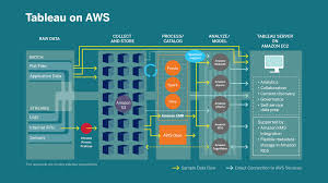
Unlocking the Power of Modern Cloud Analytics: A Tableau and AWS Initiative According to IDC research, analytics spending on the cloud is growing eight times faster than other deployment types. A comprehensive cloud technology stack supports data integration, self-service analytics, and essential use cases for digital transformation and analytics at scale. To help customers harness the power of cloud-based self-service analytics, Tableau continues to invest in its Modern Cloud Analytics initiative, launched at the Tableau Conference in 2019. What is Modern Cloud Analytics? Modern Cloud Analytics (MCA) combines the expertise and resources of Tableau, Amazon Web Services (AWS), and their partner networks. This collaboration maximizes the value of end-to-end data and analytics investments, from data strategy and migration to operational optimization. MCA helps organizations at any digital transformation stage securely deploy and scale cloud analytics, delivering faster time to value and reduced costs with validated migration processes that mitigate risk. Core Product Integration and Connectivity Tableau integrates seamlessly with AWS services, providing a complete solution for analyzing data stored in Amazon’s infrastructure. Key integrations include: Amazon S3 Connector: Leveraging Tableau’s Hyper in-memory data engine, this connector reads Parquet or CSV files directly from Amazon S3, eliminating the need for Hyper extracts. Available in Tableau Cloud and Tableau Exchange.Amazon Athena Connector: Now supports third-party identity providers (IdP) like Azure AD and Okta, offering secure and flexible authentication with multi-factor options.Amazon OpenSearch Connector: Developed by the Amazon OpenSearch Service team, available on Tableau Exchange.Amazon DocumentDB Connector: Created by the Amazon DocumentDB Service team, featured on Tableau Exchange.Amazon Neptune Connector: Developed by the Amazon Neptune Service team, available on Tableau Exchange. Skip Server Administration with Tableau CloudTableau Cloud, hosted on AWS, offers significant cost savings and performance improvements. “With Tableau Cloud, we’re saving over $300,000 annually in server and platform administration costs, with dashboard performance improving by 2x,” said Raj Seenu, Senior Director of Data Technologies at Splunk. This platform allows IT and data engineers to focus on other critical tasks, demonstrating a cloud-first approach. Splunk anticipates doubling its enterprise analytics adoption by the end of 2021. Getting Started with Modern Cloud AnalyticsThe MCA program assists customers in migrating data and analytics workloads to AWS, unlocking the benefits of a cloud-based analytics strategy. *Source: IDC InfoBrief, sponsored by Tableau and AWS, Cloud Business Intelligence and Analytics, doc #US46135420TM, April 2020. Like Related Posts Salesforce OEM AppExchange Expanding its reach beyond CRM, Salesforce.com has launched a new service called AppExchange OEM Edition, aimed at non-CRM service providers. Read more The Salesforce Story In Marc Benioff’s own words How did salesforce.com grow from a start up in a rented apartment into the world’s Read more Salesforce Jigsaw Salesforce.com, a prominent figure in cloud computing, has finalized a deal to acquire Jigsaw, a wiki-style business contact database, for Read more Health Cloud Brings Healthcare Transformation Following swiftly after last week’s successful launch of Financial Services Cloud, Salesforce has announced the second installment in its series Read more

Read More
Salesforce Tableau Pulse

Tableau Pulse and Tableau GPT

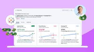
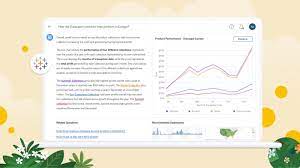
Most of us are quite familiar with Chat GPT, the revolutionary Large Language Model from Open AI that is transforming the world of AI interactions far beyond research labs. Recently, Tableau unveiled Tableau GPT at TC 2023, a new tool leveraging generative AI. But what is Tableau GPT, and how does it integrate with Tableau’s current array of product offerings? Tableau Pulse and Tableau GPT work together. Complementing Tableau GPT’s natural language capabilities is the newly launched user interface, Tableau Pulse. Designed as a personal data guide, Pulse presents you with a curated, ‘newsfeed’-like view of your key metrics, a game changer for business leaders needing to keep a close eye on performance indicators. So Tableau AI is a suite of capabilities that brings trusted predictive and generative AI to the entire Tableau Platform to simplify and democratize data analysis and insight consumption at scale. Tableau GPT: Tableau GPT is an assistant utilizing advanced generative AI to streamline and democratize the data analysis process. Developed in collaboration with OpenAI, it is derived from Einstein GPT, a recently introduced Salesforce product. Tableau GPT seamlessly incorporates generative AI into Tableau’s user experience, aiming to enhance productivity, accelerate learning, and improve communication. During the TC keynote’s Devs on Stage segment, Matthew Miller, Senior Director of Product Management, showcased Tableau GPT’s ability to generate calculations. With a prompt like “Extract email addresses from JSON,” Tableau GPT swiftly provided a calculation that could be easily integrated into the calculation window. Tableau Pulse: Additionally, Tableau GPT also powers the new Tableau tool named Tableau Pulse, enabling users to generate powerful insights rapidly. In this tool, Tableau Pulse offers “data digests” on the user’s personalized metrics homepage, allowing customization. Users can have a curated, ‘newsfeed’-like experience of key KPIs, personalized over time as Pulse learns user preferences. Tableau Pulse provides metrics to pay attention to, based on recent data trends recognized by Tableau GPT. Users can follow KPIs and receive the latest values, visual trends, and AI-generated insights. Moreover, Tableau Pulse responds to natural language queries about data. For instance, when asked, “What is driving change in Appliance Sales?” Tableau Pulse provides a quick answer with a visualization. Tableau Pulse helps everyone in your organization integrate data into their daily jobs to make better, faster decisions. Without having to learn a new tool or build comprehensive visualizations, Tableau Pulse helps you go beyond the how and what and shows you the why behind your data. After obtaining insights from Tableau Pulse, users can drill down further by asking follow-up questions. For example, asking, “What else should I know about air fryers?” reveals an insight that the “inventory fill rate” for air fryers is forecasted to fall below the predetermined threshold. Knowing where, when, and why to pay attention to your business has never been easier. Within Tableau Pulse, the Insights platform automatically detects drivers, trends, contributors, and outliers for the metrics you follow. It proactively flags changes that matter to you. Using natural language and supporting visual explanations, Now Tableau Pulse summarizes the insights so you can make appropriate and timely decisions. Tableau Pulse and Tableau GPT Tableau GPT and Pulse are poised to transform the interaction with Tableau products. These tools will expedite the creation of visualizations, a hallmark of Tableau, and provide non-technical users with quick data comprehension without additional development time. Users access Tableau Pulse from the Tableau Cloud navigation menu, but the metrics in Tableau Pulse aren’t part of the project content hierarchy in Tableau Cloud or governed by project-based permissions. The ability to create or see metrics is based on permission to connect to and access data in a data source. Like1 Related Posts Salesforce OEM AppExchange Expanding its reach beyond CRM, Salesforce.com has launched a new service called AppExchange OEM Edition, aimed at non-CRM service providers. Read more The Salesforce Story In Marc Benioff’s own words How did salesforce.com grow from a start up in a rented apartment into the world’s Read more Salesforce Jigsaw Salesforce.com, a prominent figure in cloud computing, has finalized a deal to acquire Jigsaw, a wiki-style business contact database, for Read more Health Cloud Brings Healthcare Transformation Following swiftly after last week’s successful launch of Financial Services Cloud, Salesforce has announced the second installment in its series Read more

Read More
Big Data and Data Visualization

Big Data and Data Visualization Explained

Data Visualization: Turning Complex Data into Clear Insights Data visualization is the practice of converting information into visual formats, such as maps or graphs, to make data more accessible and understandable. The primary purpose of data visualization is to highlight patterns, trends, and outliers within large data sets, allowing users to quickly glean insights. The term is often used interchangeably with information graphics, information visualization, and statistical graphics. The Role of Data Visualization in Data Science Data visualization is a crucial step in the data science process. After data is collected, processed, and modeled, it must be visualized to draw meaningful conclusions. It’s also a key component of data presentation architecture, a discipline focused on efficiently identifying, manipulating, formatting, and delivering data. Importance Across Professions Data visualization is essential across various fields. Teachers use it to display student performance, computer scientists to explore AI advancements, and executives to communicate information to stakeholders. In big data projects, visualization tools are vital for quickly summarizing large datasets, helping businesses make informed decisions. In advanced analytics, visualization is equally important. Data scientists use it to monitor and ensure the accuracy of predictive models and machine learning algorithms. Visual representations of complex algorithms are often easier to interpret than numerical outputs. Historical Context of Data Visualization Data visualization has evolved significantly over the centuries, long before the advent of modern technology. Today, its importance is more pronounced, as it enables quick and effective communication of information in a universally understandable manner. Why Data Visualization Matters Data visualization provides a straightforward way to communicate information, regardless of the viewer’s expertise. This universality makes it easier for employees to make decisions based on visual insights. Visualization offers numerous benefits for businesses, including: Advantages of Data Visualization Key benefits include: Challenges and Disadvantages Despite its advantages, data visualization has some challenges: Data Visualization in the Era of Big Data With the rise of big data, visualization has become more critical. Companies leverage machine learning to analyze vast amounts of data, and visualization tools help present this data in a comprehensible way. Big data visualization often employs advanced techniques, such as heat maps and fever charts, beyond the standard pie charts and graphs. However, challenges remain, including: Examples of Data Visualization Techniques Early computer-based data visualizations often relied on Microsoft Excel to create tables, bar charts, or pie charts. Today, more advanced techniques include: Common Use Cases for Data Visualization Data visualization is widely used across various industries, including: The Science Behind Data Visualization The effectiveness of data visualization is rooted in how humans process information. Daniel Kahneman and Amos Tversky’s research identified two methods of information processing: Visualization Tools and Vendors Data visualization tools are widely used for business intelligence reporting. These tools generate interactive dashboards that track performance across key metrics. Users can manipulate these visualizations to explore data in greater depth, and indicators alert them to data updates or important events. Businesses might use visualization of data software to monitor marketing campaigns or track KPIs. As tools evolve, they increasingly serve as front ends for sophisticated big data environments, assisting data engineers and scientists in exploratory analysis. Popular data visualization tools include Domo, Klipfolio, Looker, Microsoft Power BI, Qlik Sense, Tableau, and Zoho Analytics. While Microsoft Excel remains widely used, newer tools offer more advanced capabilities. Data visualization is a vital subset of the broader field of data analytics, offering powerful tools for understanding and leveraging business data across all sectors. Like Related Posts Salesforce OEM AppExchange Expanding its reach beyond CRM, Salesforce.com has launched a new service called AppExchange OEM Edition, aimed at non-CRM service providers. Read more The Salesforce Story In Marc Benioff’s own words How did salesforce.com grow from a start up in a rented apartment into the world’s Read more Salesforce Jigsaw Salesforce.com, a prominent figure in cloud computing, has finalized a deal to acquire Jigsaw, a wiki-style business contact database, for Read more Health Cloud Brings Healthcare Transformation Following swiftly after last week’s successful launch of Financial Services Cloud, Salesforce has announced the second installment in its series Read more

Read More
Salesforce Success Story

Case Study: Google Cloud and Tableau Ecommerce Success

An industry leader in lifesciences research and ecommerce, is tasked with integrating recent acquisitions, standardizing processes, and improving marketing return-on-investment. Ecommerce company moves to the cloud and adopts Google Cloud and Tableau to improve sales and operational efficiency. Google Cloud and Tableau Ecommerce Success to the rescue. Industry: Lifesciences and Biotechnology Research Problem: Leadership requested help driving an improved culture of proactive decision-making, rather than reactive. Implemented : Our solution? Results: Salesforce offers customized solutions for the ecommerce industry, assisting companies in this field to provide outstanding customer experiences, optimize workflows, and spur growth and brand loyalty. Salesforce offers digital transformation technology for life sciences, ecommerce, and biotechnology research industries. If you are considering a Salesforce health and life sciences implementation, contact Tectonic today. Like2 Related Posts Salesforce OEM AppExchange Expanding its reach beyond CRM, Salesforce.com has launched a new service called AppExchange OEM Edition, aimed at non-CRM service providers. Read more The Salesforce Story In Marc Benioff’s own words How did salesforce.com grow from a start up in a rented apartment into the world’s Read more Salesforce Jigsaw Salesforce.com, a prominent figure in cloud computing, has finalized a deal to acquire Jigsaw, a wiki-style business contact database, for Read more Health Cloud Brings Healthcare Transformation Following swiftly after last week’s successful launch of Financial Services Cloud, Salesforce has announced the second installment in its series Read more

Read More
  • 1
  • 2
gettectonic.com