The Importance of Button Order in Salesforce Instances
How much thought is given to the order of buttons in a Salesforce instance page layout? Or even for specific user groups? It is common to see varying button orders on pages for different objects, which can be quite frustrating. Salesforce Button Order UX ideas!
This insight advocates for careful consideration of the placement of these seemingly simple but crucial buttons. Buttons play a significant role in user interactions, so organizing them effectively can reduce mental effort and clicks for colleagues.
For clarity, this discussion refers to “buttons,” but depending on the Salesforce context, these may also be known as “actions” or “quick actions.” Regardless of the terminology, this refers to the elements at the top right of a page or within the Chatter feed and Activity Feed that users click to perform actions.
Buttons at the top of the page typically appear as square icons. In Chatter and Activities, they might be displayed as tab-like or button-like elements.
The Activity Feed, for example, may show buttons as part of a tabbed view or as individual buttons, sometimes stacked under carats for similar actions.
Consistent Button Order
The order of buttons should be consistent across objects whenever possible. Although objects with additional or unique buttons may necessitate deviations from this principle, maintaining a standard order for basic buttons like Edit, Printable View, Clone, and Delete is beneficial.
Standard Action Buttons:
- Edit: This button is anticipated to be the most frequently used. It should be placed first, or “farthest to the left” in left-to-right languages.
- Printable View: This button’s necessity is debatable, as it is rarely used and often yields poor results. If included, it should be second-to-last.
- Clone: While its necessity can be questioned, it is useful when present. It should be positioned accordingly if included.
- Delete: Although necessary for those with delete permissions, it should be placed last in the order and potentially hidden behind a dropdown to minimize accidental deletions.
For additional standard buttons like Submit for Approval or Change Owner, use the following principles:
- Edit should be first.
- Delete should be last.
- Other buttons should be ordered based on their expected usage.
- Maintain consistency across objects where possible.
Custom Buttons
Custom buttons add complexity to design choices. Often, custom buttons include emojis, which can affect visual consistency but add a fun element. While custom buttons may have longer labels than standard ones, their placement generally prioritizes visibility. Custom buttons are often placed before the Edit button to ensure prominence, although Edit may remain first if necessary.
Example: Custom buttons, such as a “🧮 Request an Invoice” button, might be placed before standard buttons.
Display Number of Buttons
Consider the number of buttons visible on a page. Avoid relying solely on Salesforce’s default settings. Display four, five, or even six buttons if they are needed and can fit on the screen. Fewer buttons might be preferable to hide less frequently used options like Delete under a dropdown. Keep in mind that users might overlook dropdown options, so training and reminders are important.
Note: In the Highlights Panel component settings, consider hiding the Follow/Unfollow button if it is rarely used.
Actions in Feeds
The same principles apply to buttons in Chatter and Activity Feeds, though there are usually fewer buttons to manage.
- Chatter Feed: Remove the Poll button if it is rarely used and retain only essential options like Post.
- Activity Feed: Prioritize frequently used tools like Email or Task. Arrange task-related buttons chronologically to help users differentiate between them.
Controlling Button Order
To manage button placement:
- Global Publisher Layout: This setting controls default button placement across objects. Adjust this layout to set a preferred default order.
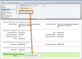
- Page Layouts: If actions are overridden on specific pages, adjust the order in the Salesforce Mobile and Lightning Experience Actions section of the page layout editor. This is also where custom buttons should be added.
- Dynamic Forms: For those using Dynamic Forms, manage button order in the Lightning App Builder.
Take Charge of Your Design
With these tools and guidelines, take control of button and action placement on your Salesforce pages to enhance usability and efficiency.


