Customizing the Salesforce user interface (UI) can significantly enhance your organization’s experience, offering a swift and cost-effective process that even those new to administration can manage. A well-designed UI is crucial as it can either elevate or hinder a system’s effectiveness. Investing in Salesforce User Interface Features can lead to substantial returns, including higher user adoption rates. Creating an intuitive and cohesive interface that reflects your brand can enhance user satisfaction and encourage greater engagement with Salesforce.
The field of user experience design for Salesforce is becoming increasingly important, as highlighted by the availability of certifications in this area. In this insight, we explore essential Salesforce UI features that can benefit every organization, with insights from certified Salesforce Administrator Stacy O’Leary, who notes, “Happy users mean a happy org.”
Take Control of Your Salesforce UI
Customizing the Salesforce App
Users appreciate a personalized Salesforce experience. Start by creating a dedicated Salesforce app for each user group or persona in your organization. This approach allows you to display relevant tabs and name the app after the user group, such as “UC – Human Resources” or “UC – Marketing.”
Homepages: Old vs. New Solutions
- Old Solution: Create separate homepages for each profile.
- New Solution: Use one Lightning homepage with common components and add unique report components for each team. Set component visibility based on user profiles to ensure reports display only for relevant teams.
Themes and Branding
Personalize Salesforce’s appearance to align with your brand by incorporating logos, default images, and colors. Navigate to Setup → User Interface → Themes and Branding for these settings.
Custom Hyperlink Color
You can customize the color of hyperlinks in your organization to match your branding.
MyDomain Logo and RightFrame URL
Customize the Salesforce login page to reflect your company’s identity, either by keeping it standard or adding custom branding elements.
Enhancing Page Layouts and Navigation
Page Layouts and Lightning Pages
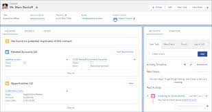
Use Lightning App Builder to add, remove, or reorder components on record pages or homepages, creating custom, user-friendly pages. Dynamic Forms further enhance the user experience by simplifying form management.
Compact vs. Comfy Navigation
Salesforce offers two display densities:
- Comfy: Provides a spacious view with labels on top of fields and more space between elements.
- Compact: Offers a denser view with labels to the left of fields, reducing the need to scroll.
Compact Layouts
Present key fields concisely in both the Salesforce mobile app and Lightning Experience, providing quick access to essential information.
Conditional Lightning Page Components
Lightning pages can include conditional components that display based on criteria like field values, record type, user profile, or device, reducing the need for multiple layouts and enhancing customization.
Rich Text Components
Use rich text components to share messages, include links, or celebrate achievements, enhancing communication and engagement.
List Views
Organize list views effectively with proper naming conventions and numbering, making it easier for users to find what they need. Assign the Manage Public List Views permission to responsible individuals to oversee list views.
Salesforce Path and Guidance
Salesforce Path helps guide users through business processes, highlighting key fields and providing guidance at each step. This feature streamlines processes and enhances user experience.
Salesforce Celebration
Celebrate achievements with Salesforce Celebration, a feature that adds visual effects like confetti when key milestones are reached, enhancing user engagement and morale.
Additional Customization Features
Keyboard Shortcuts
Boost productivity with keyboard shortcuts, especially useful for teams managing multiple cases.
Icons and Image Formulas
Enhance the user experience by incorporating icons in list views, record pages, and reports.
Validation Rule Messages
Validation rules ensure data accuracy, and creative error messages can make the experience more engaging. The new Custom Error Flow component in Winter ’24 allows for more sophisticated messaging.
Search Layouts and Filters
Customize search layouts to optimize search results and use filters to refine searches, improving user efficiency.
Einstein Search
Einstein Search, now default in Salesforce, offers quick, intuitive search results and supports natural language queries.
Letterheads and Email Templates
Create consistent branding with custom letterheads and email templates, accessible via Setup → Letterheads.
Screen Flows
Screen Flows guide users through processes with interactive steps, integrating seamlessly into Lightning pages.
Enhanced Dashboards
In Salesforce Unlimited and Performance editions, dashboards now support up to 25 components, including text and image widgets, enriching the analytics experience.
Inline Editing
Inline editing in list views and reports increases productivity by allowing users to make changes directly, reducing the number of clicks needed.
In conclusion, a well-designed Salesforce UI is integral to user satisfaction and system success. By tailoring the interface to reflect your brand and meet user needs, you can foster a more engaging and productive Salesforce environment.

